Future Phenomenology and MMPA
Highlights from our recent acquisitions to the collection,
books and some thoughtful works for sale
February 10 - April 15, 2023
The Museum will be closed April 6 through April 14.
2022 was an exciting year for MMPA and we are giddy about all that we have accomplished. For instance, we gained a new space, more volunteers, new advisory board members and community support while hundreds of new works were donated to our permanent collection. Our latest book, Barbara Morris Goodbody, A Life in the Arts is complete (and available in our book section with 100% donation to MMPA). As curator and director I’ve been thinking a lot about where we’re headed, what’s important, and how grateful we are to be open to the public again. I’m also pondering how a collection can define an institution and its vision or focus. Collectors are important as they are the stewards of an artist’s ideas and sympathies, as well as the context of when the work was made. These carefully chosen collections often become self portraits of their agents and tell us about their individual interests and passions. We are fortunate to these donors and the artists who made such interesting and timely works. Please join us for some insights into our collection, vision and perhaps a glimpse at where we’re headed.
—Dir. Denise Froehlich
GALLERY TALKS:
FEBRUARY 24, 5 - 8PM
With JAMES MULLEN
MARCH 31, 5 - 8PM
With MICHAEL KOLSTER
We are fundraising for the 2023 year of programming, salaries and marketing. Your help is greatly appreciated. Thank you.
James Mullen
Flora
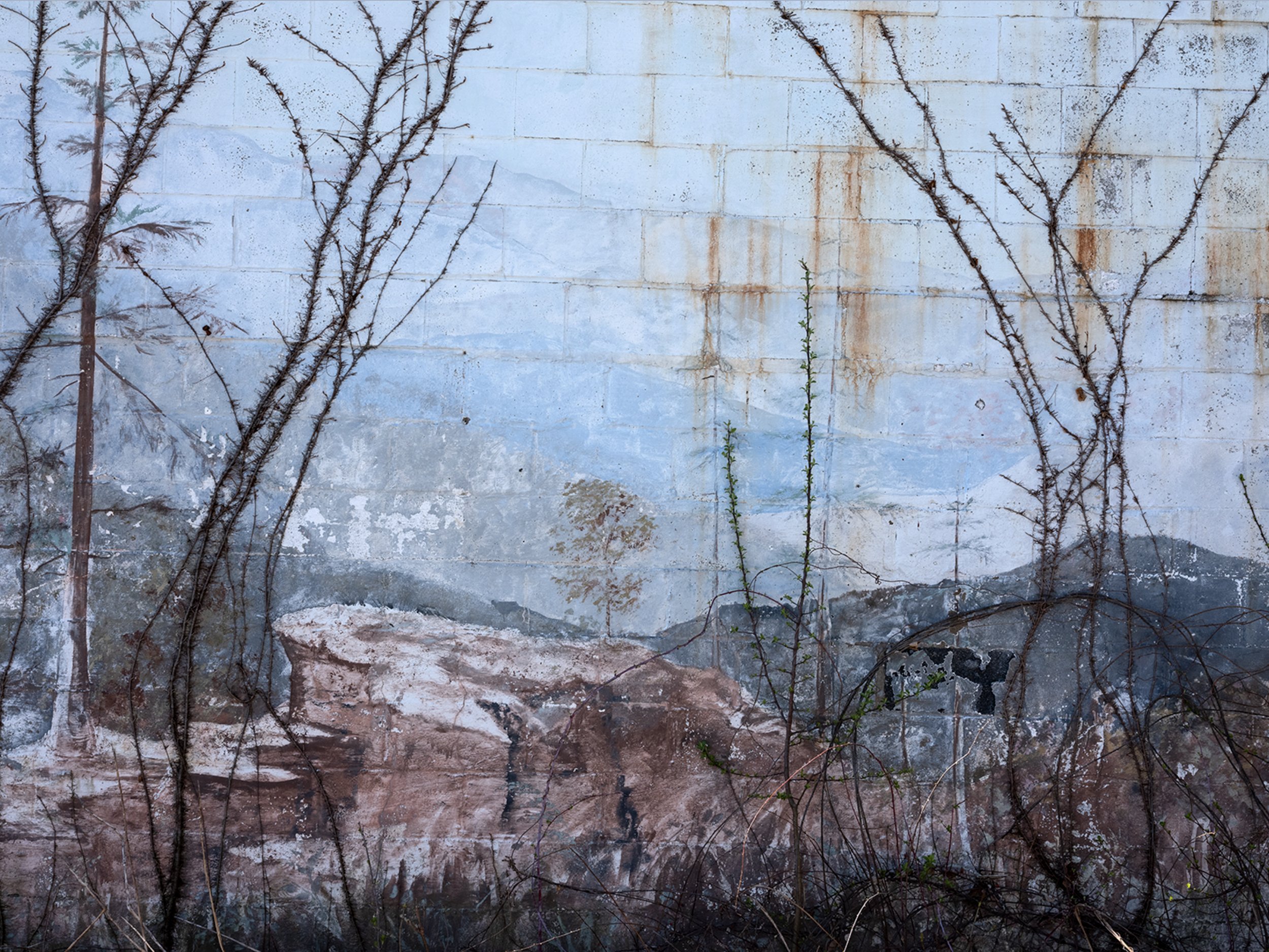
James Mullen, Flora #19 from the Book of Hours series, 2022, Digital print, 15 x 11 inches, $600.
These are direct scans of floral “landscapes” that explore the space between painting and photography, microcosm and macrocosm, interiority, and the world around us. From the confines of my studio scanner, they seek to build a larger sense of the possibilities for visualizing the natural environment and how we respond to it. The scanner is a long exposure camera that offers unique possibilities for creating light and space, the cornerstones of landscape imagery. This work extends a conversation that includes medieval illuminated manuscripts, Japanese ukiyo-e prints, American landscape painting, flower arrangement, and contemporary color photography. Through these many different areas of interest, I am interested in synthesizing rich images that encourage the viewer to reconsider both our ideas about what constitutes Nature, as well as our relationship to it.
— James Mullen
Non-Site Prospects
This body of work is an investigation into how a landscape can be represented. Departing from ideas about Robert Smithson’s Non-Site works, I began to experiment with collaging digital images with some instant photography of those sites (more singular experience), in conjunction with material samples I had gathered on location. I started to occasionally collect items from the sites I visited as a physical reminder of the materiality of the site. I also began to realize that there could even be a corollary to religious relics that pilgrims would collect along their travels. I think that these works function as a sort of modern reliquary, as a sort of container of holy relics. These works explore the ideas of veneration and representation, both in materiality and schematic (maps, mirrors, etc.) modes, while exposing their limitations.
— James Mullen
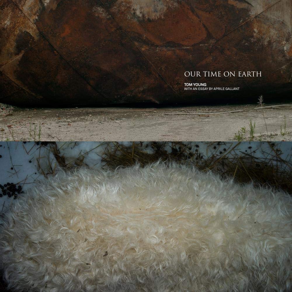
Tom Young, Our TimeOn Earth, With a an essay by April Gallant, Hardcover, 152 pages, 12 x 12 inches, George F. Thompson Publishing. $50
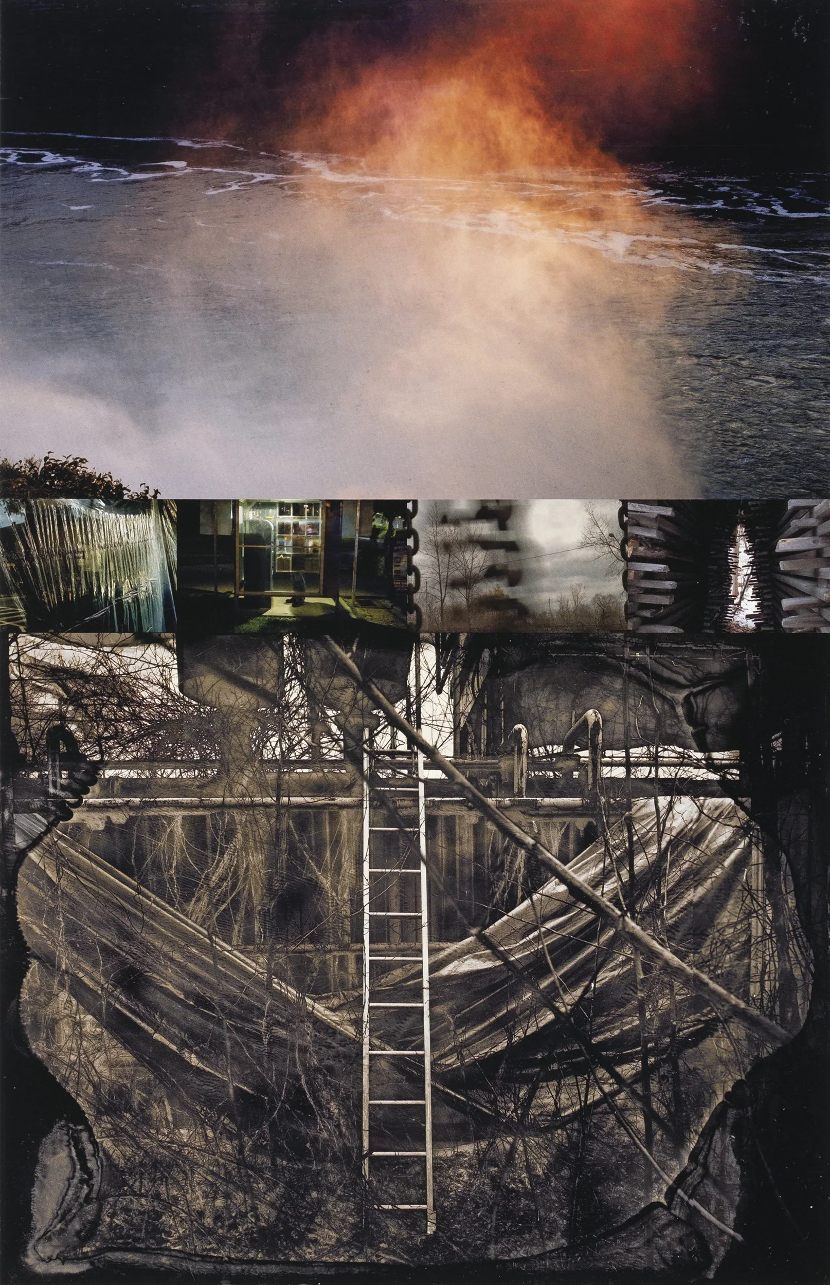
Tom Young, Dorsal Fin, from Our Time on Earth, 2020, Inkjet print, 24 x 32 inches, On loan from Bill Press and Elana Auerbach
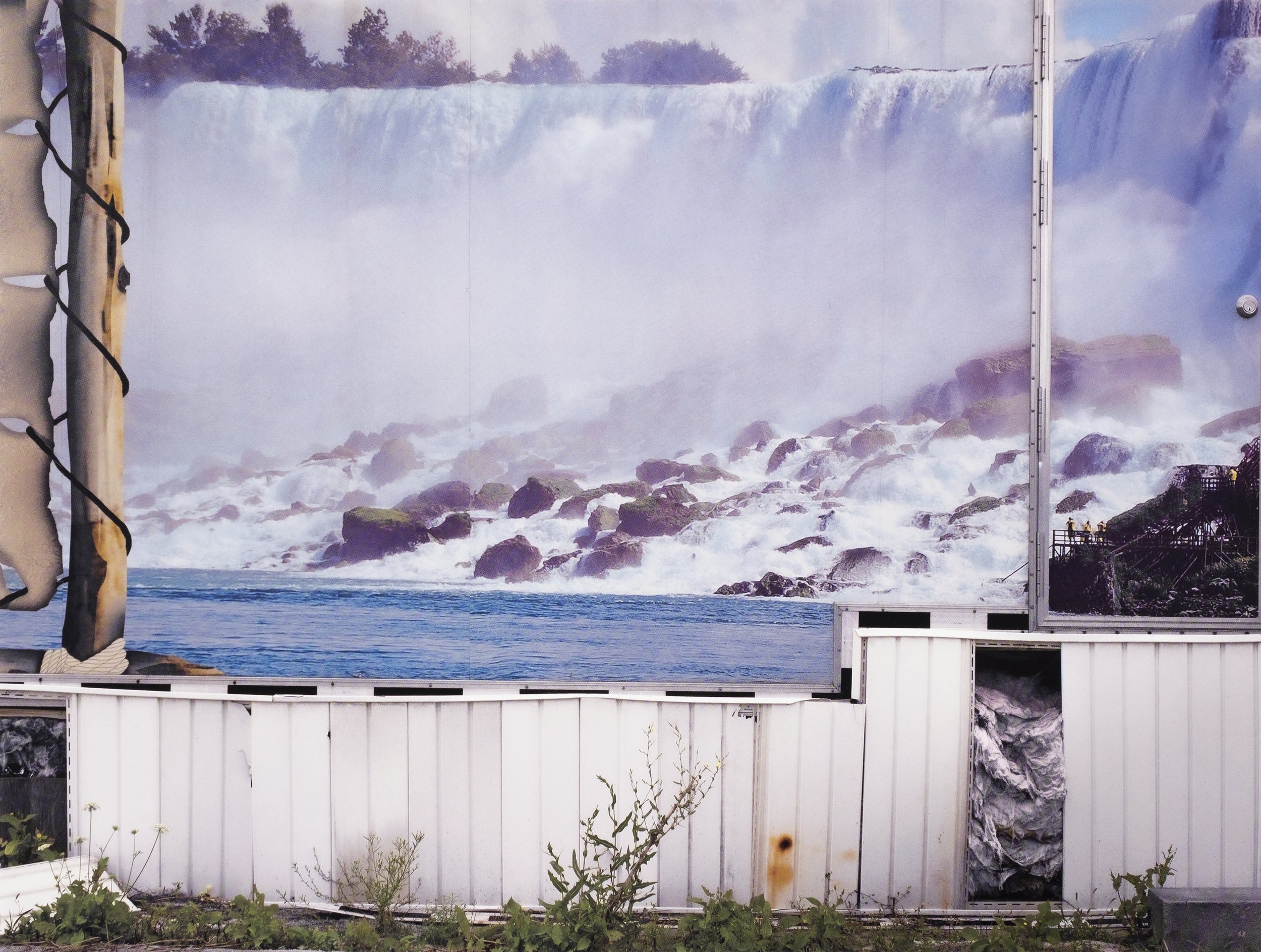
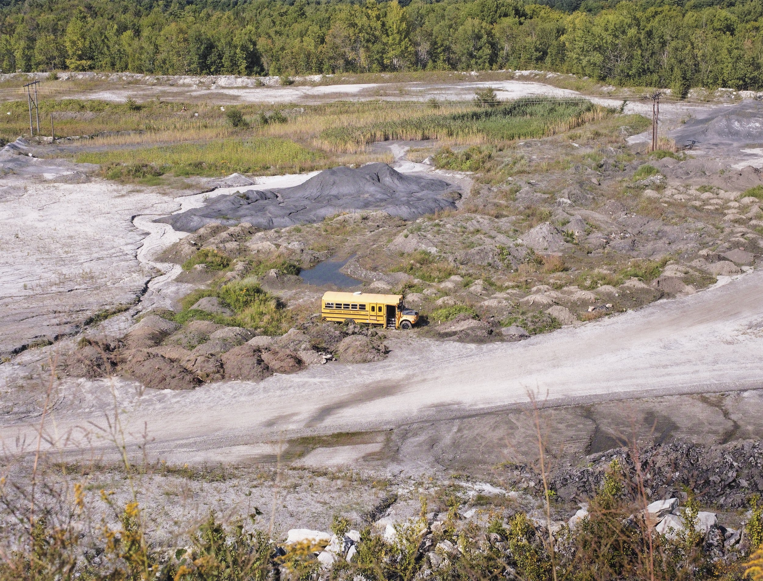
From the Our Time on Earth portfolio
Young brings to us a visual narrative that simultaneously hints at the apocalyptic unfolding of contemporary life while offering reverential hope for a better world. Through a collision of images as minute as a molded snow globe, as expansive as a roiling ocean, and as haunting as steam belching from the tower of a nuclear power plant, Young brings the reader on an epic journey. Here one finds the prayerful silence of a goat at peace in a freshly dug grave, the human tableaux of young people amidst the drenching power of water, and the simple magnificence of moving water frozen into icy stillness. Here as well one finds disturbing aspects of the human mosaic to be found in the common places of everyday life, from a school bus abandoned in a vast mined landscape to a collapsing building in the shape of a large cat.
In Tom Young's universe, juxtaposition tells a story while the precise rendering of a moment in time speaks to the mystery of creation and the devotion of a photographer trying to understand a complicated world. As curator Aprile Gallant observes in her insightful essay: "The images build upon the other, veering from macro to micro, from vegetable, animal, and mineral to welded, constructed, and manufactured . . . The aggregate of viewing is an awareness of the deep interconnectedness of humans and their environment, a drama that plays out in equally beneficial and devastating ways."
Our Time on Earth plays knowingly off the idea that human endeavors on the planet can be as brief as the beat of a hummingbird's wing and as long-lasting as mercury and lead embedded in a local river or stream. The question thus arises as to how the traces we leave behind from our time on Earth will reverberate as we move forward to the next generation and the next and the next.
– George F. Thompson Publishing
Timeline | Learning to See with My Eyes Closed
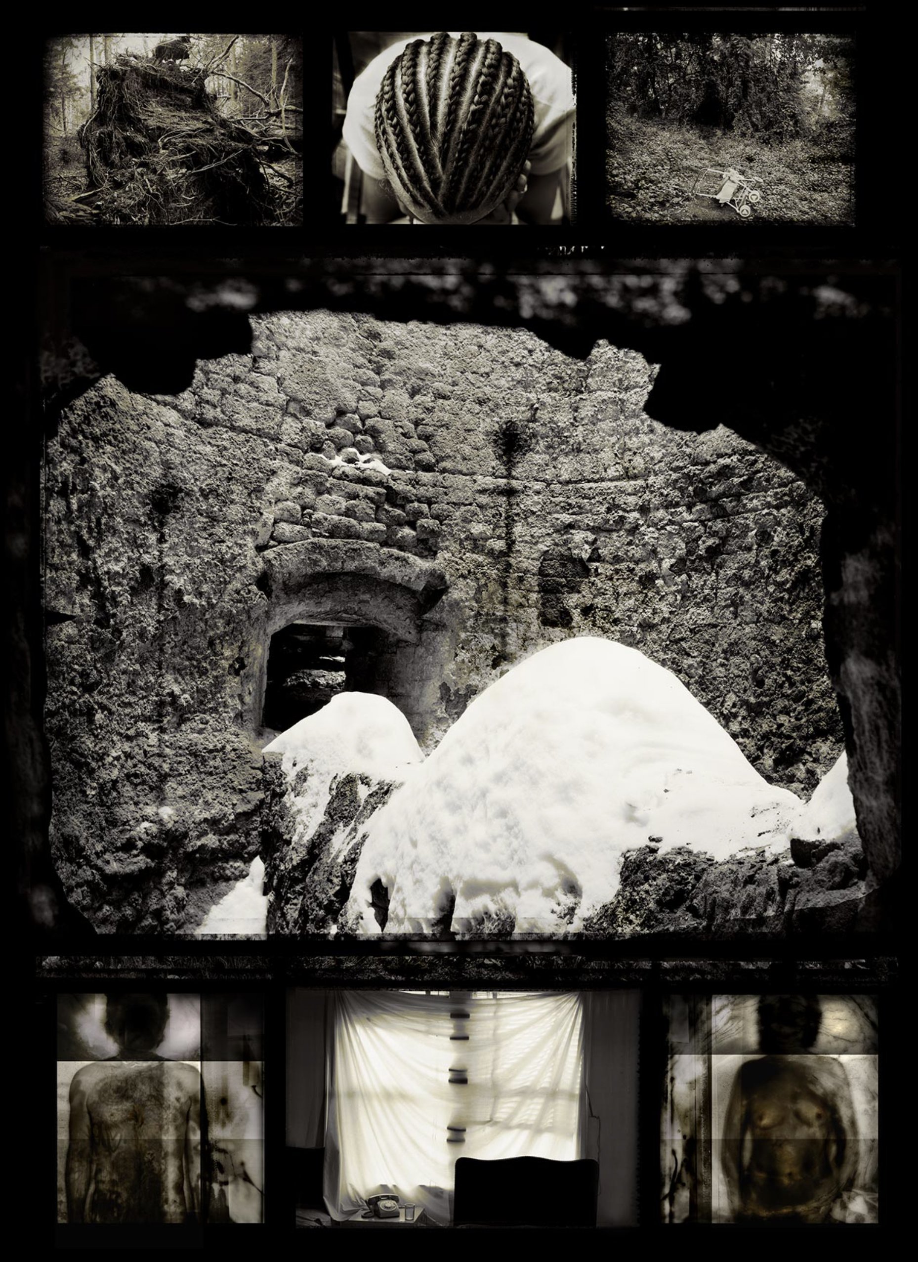
Tom Young, Timeline Learning to See With My Eyes Closed, Hardcover with jacket, 128 pages with 60 color photographs, 12 x 9 inches, George F. Thompson Publishing, $50
Timeline is among the most poetic photographic projects to emerge in the art world in years. For many of us, the photo album is a way to preserve memories of personal and family events that are worth noting, worth sharing, worth saving: pregnancies and birthdays, day trips and child's play, time with our pets, friendships and reunions, portraits of our house and garden, and even scenes of spirituality and despair caused by news of cancer. Each album thus becomes an archive of who we are as a person, as a family.
Tom Young has taken this old idea and created a new genre: visual fiction. Using iconographic, layered images to tell his story without the usual tools of vivid contrast, bold colors, or sharp, finite detail, Young's visual assemblages are personal and evocative, sharing a complex internal landscape of love and loss, seen as through a shadowy veil. Here, then, is a marriage of landscape and portraiture that suggests not only a visual narrative of the photographer's life, but also, through the power of memory and shared experience, the reader's life.
When Young was only ten years old, he had a medical procedure that left his eyes fully bandaged for weeks. Without sight, all of his other senses changed. Despite the darkness, he would imagine the world around him and the power of light as it relates to memory. In Timeline, one senses that the artist is seeing his entire world unfold before him like an end-of-life dream recollected in a few split seconds. One image leads to another, building in nuance and subtlety until we come to understand, as if by way of a sixth sense, how the little details of life create a larger retrospective. "If pictures could talk, what a tale they might tell." That thought lurks behind every image of Young's masterful visual story of a life: his? yours?
— George F. Thompson Publishing
How does one see with their eyes closed? For many photographers, it is a life-long quest to make a photograph feel like the experience of a scene rather than just make a visual representation of it. Tom Young learned this at the early age of 10 years old through the difficult experience of a sightless world for several weeks after eye surgery. While his eyes were healing under the bandages, Tom’s other senses developed into a heightened state of awareness which stayed with him for life. When the bandages were removed from his eyes, the intensity of daylight was quite painful and Tom had to reacclimate his visual senses to the world. Photography became his chosen medium of expression while studying at Goddard College, as his vision had a similar affinity to light as film, and by making images that felt like brief moments of memory or dream that became a direct representation of how his mind experienced the world. In the book, Timeline: Learning to See with My Eyes Closed, Tom created a visual narrative of the personal experiences of family life intertwined with the landscape. Working with a large format camera, blocking out distractions, the world unfolded on the ground glass as if in a dream. Combining images of ephemeral family moments with landscapes that hold the weight of history, a story develops through the conversation between the individual images. In 2016 Tom published, a second book with George F. Thompson Publishing, Backscatter: Between Here and There. This series was an exploration in the quality of backscatter, or particles that reflect or refract light as seen through the lens. Photographing at times just below the sea surface and at others through mist suspended in the air, Tom brings the viewer to an elemental experience of Earth’s most essential compound: H2O. Water, reflecting or refracting light, or raining down on humans passing through the mist, envelops the images with the wonder of its life-giving properties. Tom continues this thought of human impact on the environment in his latest book, Our Time on Earth. It is a poetic, emotional response to the state of the environment in this age of the Anthropocene. Yes, some images that contribute to the scene seem apocalyptic, but throughout the series there is also a thread of hope that nature is resilient and adaptable enough that it will go on, possibly even without us.
Time, memory and mystery are paramount in the work that I do. I seek out places to photograph where I feel something of import has happened and that memory seems to linger and present itself to me. Most photographs are about location, where we are in the world. I think my photographs are more about dislocation, where place becomes fused with memory and imagined history.
— Tom Young
Gail Skudera, Crosscurrents, 2012, Woven mixed media, 25 x 22 inches, Collection of the Maine Museum of Photographic Arts, Gift from the artist
I work with photographic prints that are deconstructed and reassembled with other materials that allow for new imagery to develop and I am passionate about the subjects that I work with.“Crosscurrents” from 2012, is based on what was a noted portrait of Vincent van Gogh at the age of 13. I’ve been working with this image of Vincent for many decades, it compels me to want to make more works in a similar vein. In 2019, an article was published by the Van Gogh Museum that announced that the subject is not Vincent himself, but a photograph of his brother Theo at the age of 15. Somehow, this ambiguity and familial bond makes the work all the more intriguing to me. As I would like for my work to portray strength, fragility, beauty, demise and love in a single moment, or frame, this photograph portrays all of that and offers to us a different perspective. Sometimes we have to look below the surface to catch a glimpse of what is really there, even if our attention is focused on what is above. To quote Virginia Woolf, “The beauty of the world, which is so soon to perish, has two edges, one of laughter, one of anguish, cutting the heart asunder.” — Gail Skudera
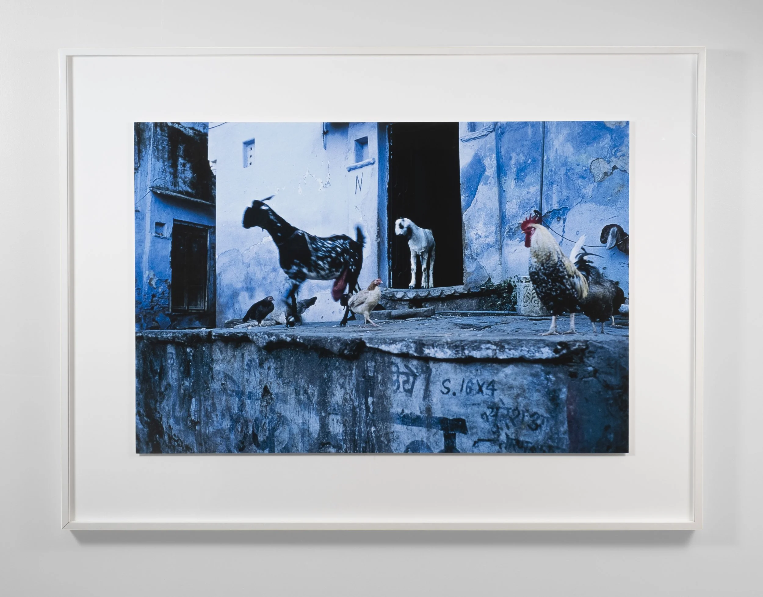
Barbara Goodbody, Untitled, From the Handfuls of Sun: A Soul Journey Through India portfolio, Inkjet print, 24 x 36 inches
"I have been blessed with many golden threads that connect me to my soul journey and web of life. Those who inspire, encourage and awaken and those who continue to enrich my life. I traveled to India 10 times between 1988-2005. It inspired me and I am grateful to all who have touched my life throughout the world. We are indeed part of this 'Family of Man....and Woman”
— Barbara Goodbody
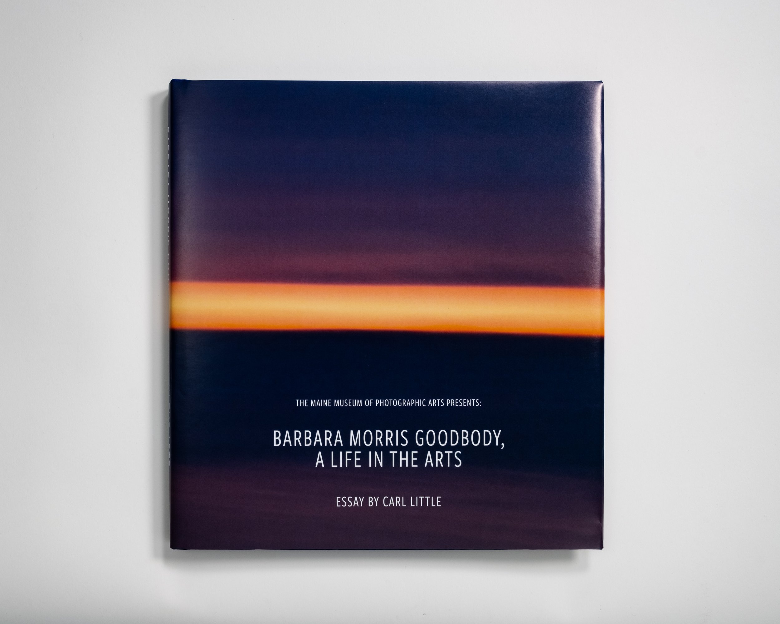
THE MAINE MUSEUM OF PHOTOGRAPHIC ARTS PRESENTS:
BARBARA MORRIS GOODBODY, A LIFE IN THE ARTS
THIS BOOK SELLS FOR A $100. DONATION TO THE MAINE MUSEUM OF PHOTOGRAPHIC ARTS.
Barbara Morris Goodbody has worn many hats in her lifetime; Artist, Collector, Philanthropist. She is also a visionary, a collaborator and a connector. The goal of this book is to commemorate and illustrate some of her contributions, share a variety of her artistic efforts, and express the gratitude of individuals and organizations she’s worked with along the way. Barbara has played key roles in shaping the arts in Maine. MMPA wishes to honor and recognize the impact of her legacy, and the contributions she has made to the culture of our state. Barbara is mercurial, intuitive, and operates from the heart in all matters. As an artist you will see her photographs progress from documentary images taken on world travels, to deeply symbolic abstraction or philosophical works that speak about the interconnectedness of mankind. Often one of her interests feeds another. For instance, her evolution and experimentation as an artist influenced her collecting and philanthropic work. Her humanitarian efforts often take the form of involvement. Throughout her life, upon seeing a need in the community, she took the initiative to launch a solution out of thin air. Barbara surrounds herself with the best possible candidates, mentors, artists, and collaborators. She isn’t afraid to give of her time, get entangled or bring about change for the greater good. As a collector, all art is equal in her eyes; folk and native art IS high art. Her collections reflect her interest in humanity and include works from Mexico, India, South America, Cuba, Haiti, Australia, Bahamas, Jamaica, France, Africa, England, Japan, Germany and China as well as North America. Her artistic interests lie in fiber arts, indigenous arts, photography, book arts and portfolios, sculpture, paintings and works on paper. At its peak Barbara’s collections have had over 3000 objects.
Since the inception of MMPA, Barbara has always been a big part of our organization. As the director, it is an honor that I would have a hand in creating this book. She was an early advisory board member and a passionate supporter of MMPA from the beginning. Barbara helped us launch the Maine Museum of Photographic arts in 2010, has exhibited her personal work and, her photography collections, collaborated on two earlier books, and most recently, she spearheaded the beginning of our new space in Portland on 15 Middle Street, in the spring of 2022. We are so grateful to Barbara for championing our Museum with her guidance and friendship and for supporting the many arts and educational institutions in this state.
– Denise Froehlich, Director of MMPA
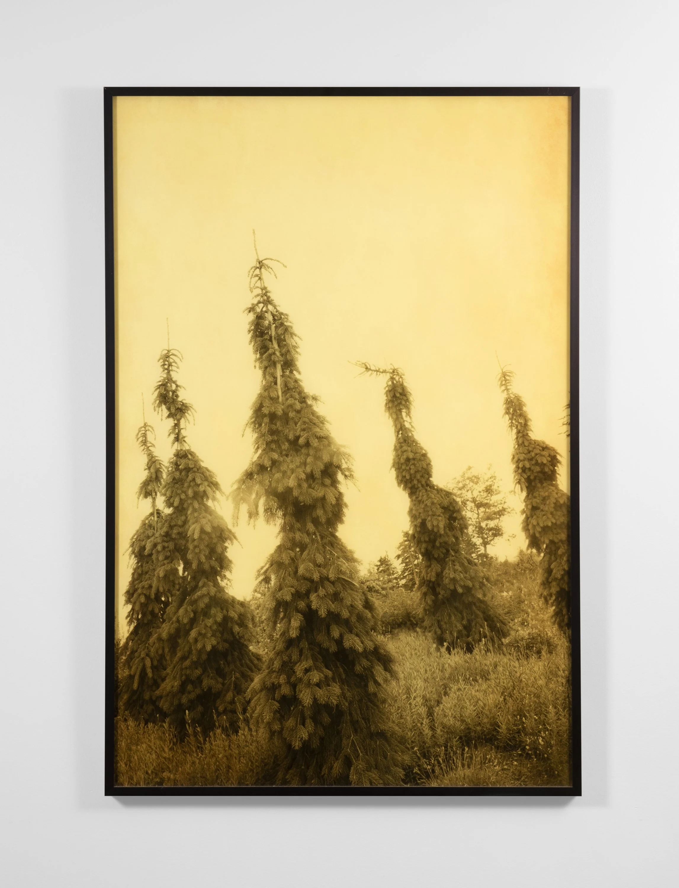
Joyce Tenneson, Gold Tree #10, 2012, Mixed media on Plexi, 30 x 24inches, Gift from the artist
"Trees thoughout history have inspired deep symbolic meaning in cultures around the world. The "tree of life" metaphor expresses the mystical concept that all forms of life are interconnected. When we stand with the trees, we feel we are part of them, and they are part of us. They give us a sense of belonging to the greater universe." – Joyce Tenneson
Internationally lauded as one of the leading photographers of her generation, Joyce Tenneson’s work has been published in books and major magazines, and exhibited in museums and galleries worldwide. Her portraits have appeared on covers for magazines such as: Time, Life, Newsweek, Premiere, Esquire and The New York Times Magazine.
“Tenneson possesses a unique vision which makes her photographs immediately recognizable. She creates enigmatic and sensuous images that are timeless and haunting.
— Vicki Goldberg
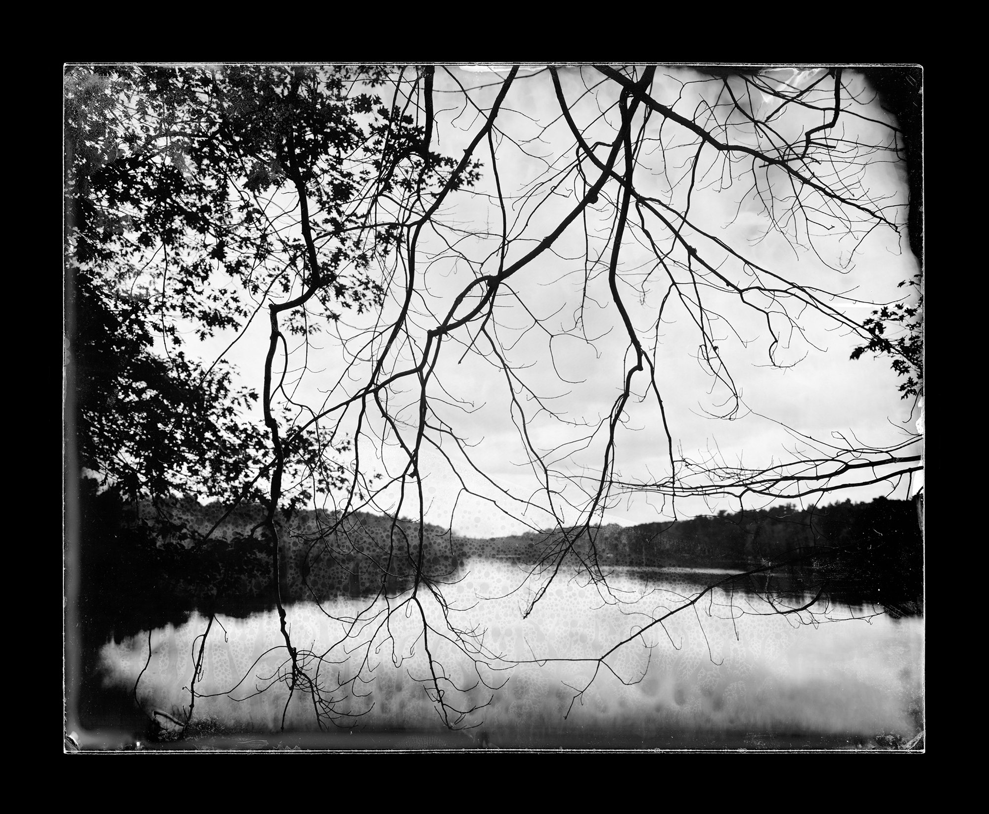
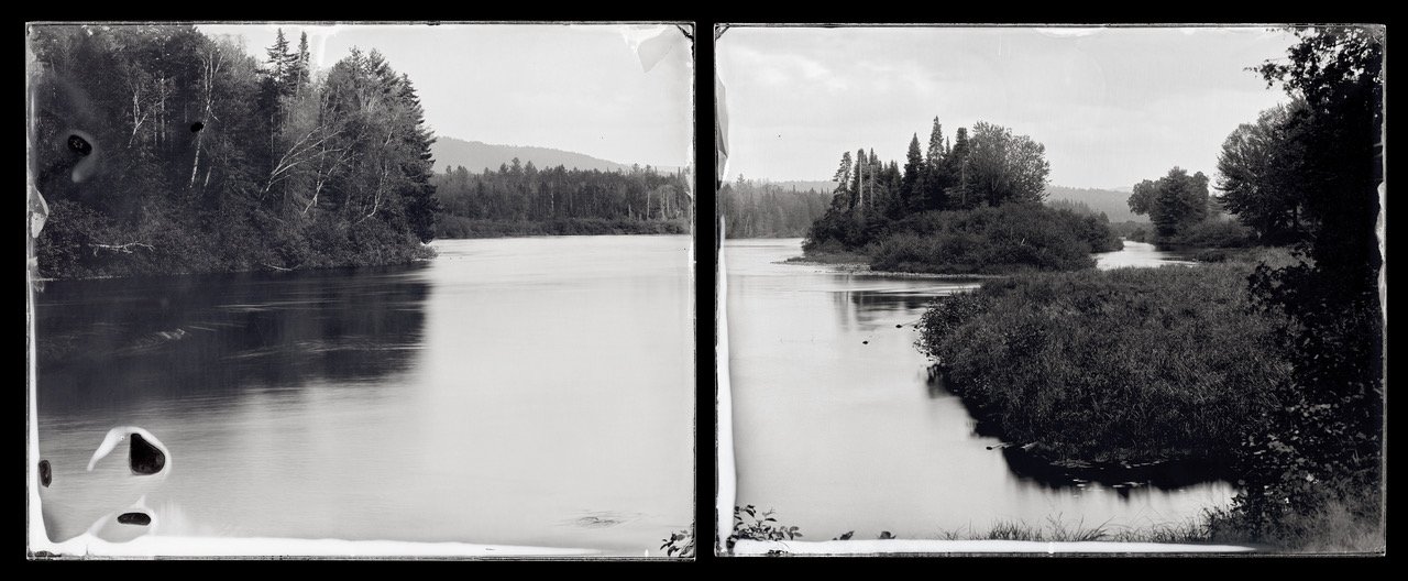
Michael Kolster, Millstone Landing, Hardeeville, South Carolina (triptych), Savannah River, 2014, Ambrotype, (triptych) 8 x 30 inches, on loan from Jennifer Press and Bobbi Frioli
Michael Kolster, Swimming Area, Thurmond Lake, Clarks Hill, South Carolina (triptych), Savannah River, 2014, (triptych) 8 x 30 inches, Ambrotypes, On loan from Jennifer Press and Bobbi Frioli
Down by the River:
Exploring American Waterways 40 Years After the Clean Water Act
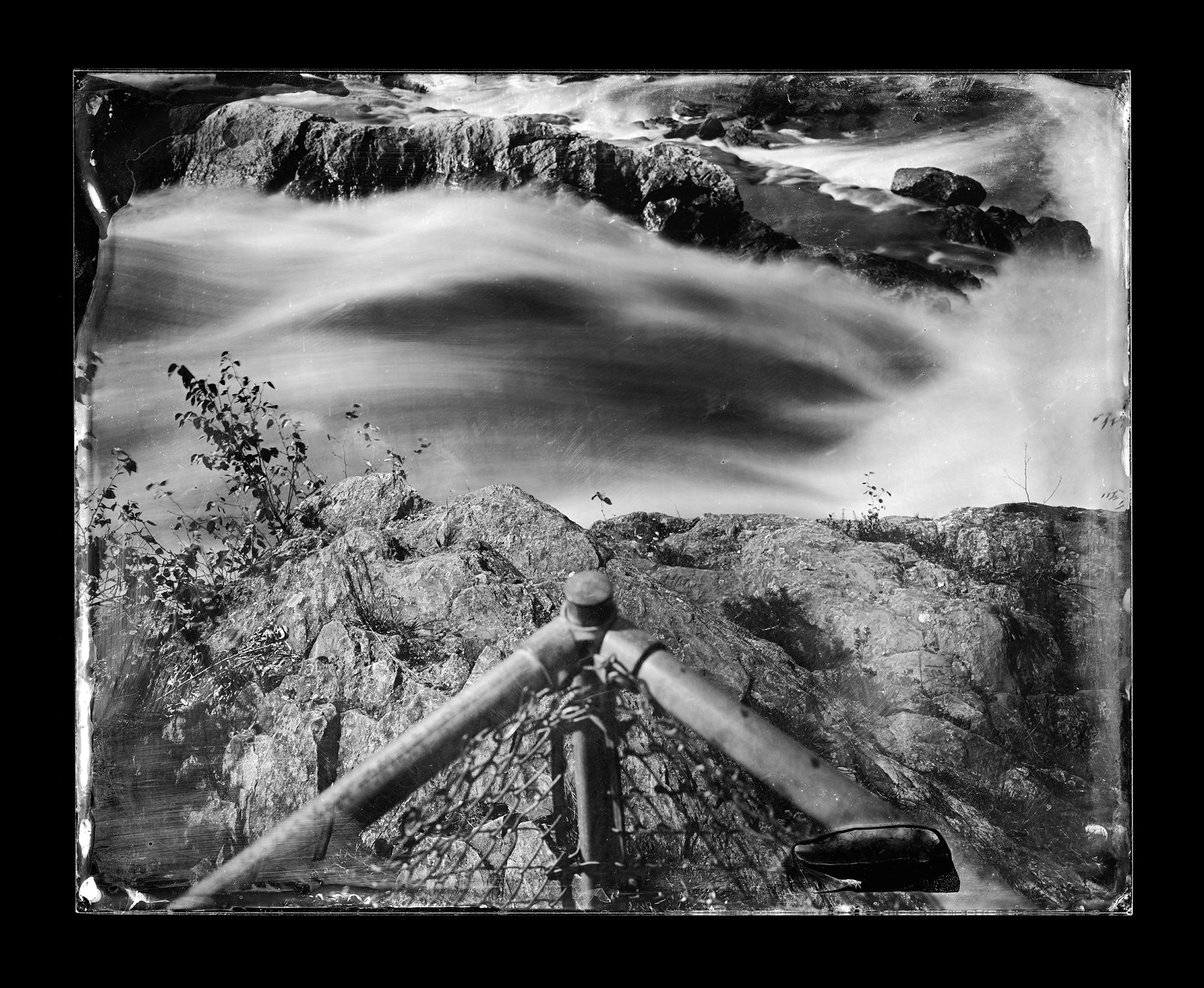
These photographs describe transitional American Rivers on the occasion of the 40th anniversary of the 1972 Clean Water Act. They also attempt to explore the paradoxical nature of rivers as particular places constantly formed by time and ever changing. My interest in rivers comes from how they embody the ever-shifting nature of our own attachments to place and to one another, giving shape to the flow of time that washes our days away.
Beyond creating conventional black-and-white and color film and digital photographs and video clips, I have experimented: by layering multiple digital exposures into one image; scanning large-format black-and-white film negatives of structures along the river’s banks, then digitally hand-coloring these images; making multiple images of a scene and arranging them in a grid to provide a larger, slightly overlapping view; and, most recently, using a wet-plate photographic process from the nineteenth-century to make ambrotypes—unique positive images formed on glass plates.
To paraphrase the pre-Socratic Greek philosopher Heraclitus, “One can never step into the same river twice.” Despite the many gains made since the Clean Water Act, America’s urban, industrial rivers will most likely always remain compromised ever-shifting affairs reflecting the dynamic nature of human and natural demands. But this doesn’t mean that they don’t matter or that they cannot recover differently. For Heraclitus, the river became a powerful metaphor shaping his larger philosophy ofpanta rhei, or “everything flows,” yet he didn’t deny permanence, either. Just as much as the waters flowing over your feet are ever changing, something of the river remains. Flux and persistence can and do coexist.
For me, photography is the vehicle to explore, embrace, and ultimately share with others the paradox that Heraclitus outlined two and half millennia ago: that flux, or change, as a central component of our daily lives, coexists with our ability to discern patterns in all that is swirling around us; that to see and remember what persists in the current of time enables us to form attachments with other people, places and things surrounding us in this life. Embracing this paradox, allowing for uncertainty to lap at the toeholds of our attachments in order to test their strength and adjust them as required, defines a part of the challenge of what it means to be human.
The invention of the wet-plate photographic process in 1850 marks an era when the industrialization and degradation of the river was kicking into high gear. And, of course, the invention of photography itself just 11 years earlier was a result of the period’s industrialization and technological advances. By using a nineteenth-century process to make photographs today, I attempt to engage the viewer in a consideration of the photograph’s slippery status as record of fact and stimulant of the imagined. The photographs’ tonalities and inherent flaws, along with the strange effect of viewing the photograph, called an ambrotype, on a plate of glass, suggest an experience of seeing that hearkens back to the 1850s, before cell phones, automobiles, and the Internet, when the places we occupied looked very different than they do today.
The process of making an ambrotype begins by pouring the collodion solution, whose consistency and color resembles maple syrup, onto a plate of 8” x 10” glass. I then dip this wet, thinly coated plate into a silver bath to sensitize it to light, run to expose the plate in the camera and quickly return to my dark box to pour developer over the still-wet plate before I fix its image permanently onto the glass in another chemical bath. All of this occurs on site at the river’s edge. Each step must be performed immediately in sequence without fail, giving me a finished photograph within 15 minutes. The results are handmade photographs, which for us these days is a bit of an oxymoron. The conventional photograph of today and for much of photography’s history is largely a product of standardized industrial and mechanical processes playing unseen in the background. As Kodak proclaimed back in its heyday, “You push the button and we do the rest.”
Running counter to George Eastman’s desire to minimize the handmade qualities of the photograph and thereby remove the messy inconsistencies of life from the production of the image for the consumer, the wet-plate process attracted me despite or perhaps due to how cumbersome, laborious, and particular it is. Initially I justified its use by how distinctive and seemingly magical the results can be. What really excited me was discovering how the process complemented my choice of subject both literally and conceptually. The physical correspondence is direct: water and “wetness” are the key elements to both. And the historic arcs of chemical photographic processes and our rivers’ industrial alteration seem to mirror one another, suggesting the two are sides of the same coin. In similar ways the photographic plate and the river convey flow and instability, while simultaneously they reference a longstanding relationship between the irrevocably altered nature of the places we live in and our ability to make photographs of them.
These resulting ambrotypes, with all their flaws, also intrigue me for how they present a contradictory vision of the world, simultaneously contemporary but seemingly from some other time and place. They describe the river as it looks and acts today in shockingly rich detail yet, because the plates are only sensitive to very limited wavelengths of visible light, most colors in the world are rendered in the images with a narrow range of tones. To me they cut between a rich, yet limited, range of information, much like a memory or a dream. I love how they suggest simultaneously the immediacy of flowing perceptual experience, of the here and now, while also conjuring up a period of time and a place we can only imagine. — Michael Kolster
Michael Kolster works for sale from the Take me to the river portfolio
Michael Kolster, Auburn Between the Bridges, Auburn, Maine, Androscoggin River, 2013, Ambrotype mounted on black acrylic, 16 x 40 inches
Take Me to the River
Michael Kolster, Take Me to the River, 2016, Essays by Alison Nordström and Matthew Klingle, 11.5" x 12" 240 pages 185 tritones 10 foldouts, hardcover with jacket, $60.00
Take Me to the River explores four post-industrial rivers that flow into the Atlantic Ocean the Androscoggin (Maine/New Hampshire), Schuylkill (Pennsylvania), James (Virginia), and Savannah (Georgia/South Carolina) as they emerge from two centuries of use and neglect. With vastly improved water quality in each river since enactment of the 1972 Clean Water Act, public affection has gradually increased as memories of foul smells and fetid water fade. Today, these rivers still carry the legacies of longstanding pollution in their currents and sediments, yet they have become waterways, renewed and rediscovered, that our grandparents never could have envisioned.
Take Me to the River comprises four portfolios of ambrotypes of these rivers, from source to sea. Three extensive essays offer different perspectives on ways of seeing and thinking about these places: one by the photographer on the collodion process; a historical view by Alison Nordström, the former Senior Curator of Photography at the George Eastman House, on the importance of Kolster’s work; and an environmental history of Atlantic rivers by the noted historian Matthew Klingle.
Kolster’s dramatic yet understated photographs were made in a portable darkroom set up along the banks of the rivers with the wet-plate photographic process, a nineteenth-century method famously used to document the battlefields of the Civil War and the great vistas of the far American West. The chemical slurries that develop and fix the image on the glass plate mimic the movements of a river’s current, and the idiosyncratic qualities of the ambrotypes reference the historical coincidence of the dawn of photography and the industrialization of Europe and America.
With consensus building about our changing climate and the extent humans are responsible, these four Atlantic rivers challenge us to set aside our usual blinders of seeing the landscape as either pure or despoiled. As the boundaries between the human and the natural are increasingly entangled, these rivers suggest how we might embrace, even cherish, places once degraded and ignored.
Paris Park Photographs
Michael Kolster, Paris Park Photographs, Clothbound with jacket 120 pages with 54 tritones, Afterword by Michelle Kuo, BILINGUAL English/French, 8.0" x 9.0" upright/portrait, $40.00
Paris Park Photographs features spectacular images from a dozen public parks and gardens in and near France's capital city. Exploring many of the same places that photographer Eugène Atget (1857-1927) made famous a century ago, Michael Kolster references the pleasures and pitfalls of wandering alone amongst trees and plants and sculpture, unkempt and formally designed places, tempered by the knowledge that the modern world with all its congestion is only a few short steps away. These intimate yet inherently expansive views of Paris's parks invite closer scrutiny of the encounters awaiting us at the edges of the well-worn paths defining our daily lives.
Few people venture into the frame of Kolster's photographs, but the promise of a renewed sense of hope and community resides in the details of his visual encounters and the moments of his heightened attention. Each picture speaks to us as a moment in time, even as the sequence suggests a choreography of place, one that can vary daily along with the changing moods and light of each park. Paris Park Photographs is presented in a bilingual English/French edition and concludes with an afterword by Michelle Kuo. Of note is how the book's design is inspired by Walker Evans's 1938 classic work, American Photographs, making Kolster's book of immediate interest to photo and book collectors.
Inspired by French photographer, Eugéne Atget, Michael visited many of the same parks of Paris, France working with rolls of 120 film and a strobe, themselves a bit outmoded today in much the same way Atget’s use of glass plates were out of fashion as he explored these parks 100 years ago. Here, Michael explored the formally designed parks out to their fringes where time, inattention and entropy allowed nature to take over where man left off. The carefully sequenced photographs of each park reveal moments along the well-worn paths through the quiet adaptations of nature among the formal designs of man. It is a documentation of revelation presented in a book inspired by Walker Evan’s, American Photographs, published by MOMA in 1938. Paris Park Photographs also includes an afterward by Michelle Kuo who is a writer, attorney and an associate professor in the History, Law and Society program at the American University of Paris. Her historical perspective and time spent in Paris’ parks will illuminate the historical significance of Michael’s photographic interpretation of these familiar places. Due to be released in the spring of 2022, keep an eye on Michael Kolster’s web site for updates.
Jack Montgomery, Edith and Cinnamon, 2017 Inkjet print, 16 x 22 inches, Gift from the artist
The photograph was taken in the barn during a terrific thunderstorm. I had been photographing with Eilidh and her wonderful family for several years and she wanted a portrait with her beloved companion. Sadly, Cinnamon died suddenly a year after the photograph was taken. - Jack Montgomery
Since my first summer with my camera I have photographed many people, usually focusing on groups. Firemen in Lower Manhattan after 9/11. Maine’s Holocaust Survivors. Judges. Fetishists. Old villagers in Tuscany. Haitian sugarcane cutters in the Dominican Republic. Dancers, circus performers and naturists in Russia. Collaborative portraiture with these groups has given access to people and places that would never have been available to me without having my camera in hand. I am now well more than 60 years old—a wonderful age for reflection and looking back—and I realize that my later life has been defined by this obsession, joined with the aesthetic of my early years along the shore. The vast majority of these images were made within a mile of the coastline of Maine and Massachusetts. Many portraits were made on islands. For me, it is the juxtaposition of the nearly perfect, emerging subject against a ground of slow decay and deterioration that illuminates the true nature of aging, and the particular beauty of this stage of life. The camera is a mirror that I hold up to my models. “Show me who you are, how you see yourself, and how you would like others to see you” is the implicit instruction. The result is what you see here. -Jack Montgomery
WERKDRUCK No. 17, photographs by Jack Montgomery, edited by Jock Sturges, 8.25 by 8.5 inches paperback portfolio book with 20 original photographs printed in Germany by Galerie Vevais. $110. Signed by Jack Montgomery.
Gift from the Richard and Jeanne Press Collection
S.B. Walker is an artist living and working in New England. His works have been exhibited internationally and can be found in public and private collections including the Museum of Fine Arts (Boston), the Peabody Essex Museum, the Fitchburg Art Museum, the Smith Museum of Art, the David Winton Bell Gallery at Brown University, the Thoreau Institute, the Museum of Fine Arts Houston, and the Paul Sack Photographic Trust. His projects have been featured in The New York Times, The Guardian, Smithsonian Magazine, Photo District News, Lens Culture, Hyperallergic, among others.
Henry David Thoreau
Henry David Thoreau, Walking, 2017, Essayist: Adam Tuchinsky, Co Production and Curation: Denise Froehlich, Dir. MMPA, Publisher: Tilbury Press, 107 pages, $20.00
This hardcover book was a collaboration between MMPA and Tilbury Press to commemorate the bicentennial of Henry David Thoreau’s birth. The introduction is written by Adam Tuchinsky, Dean of the College of Arts, Humanities and Social Sciences at the University of Southern Maine. The production and images were curated by Denise Froehlich, director of the Maine Museum of Photographic Arts. This text accompanied “ We might climb a tree, at least.” H. D. Thoreau exhibition at MMPA November, 2017- January, 2018. The impetus for this book, the companion exhibition and symposium was a donation of Six photographs made by Sam Brooks Walker and donated by Richard Press to MMPA in 2014.
“The life of Thoreau straddles the era that witnessed the birth of our modern, market- based, urban culture. A singular figure and writer, even amongst the Transcendentalists, whose impulses he shared. He was also, to borrow his mentor Ralph Waldo Emerson’s term, a “representative man.” Though he remains the towering figure in the history of nature writing, he symbolizes the way in which nature became for a certain class and subset of Americans—hipsters, bohemians, artists—and other. A creature of New England village life, Thoreau’s life was interspersed with what even he would consider wilderness excursions. Notably, he went to Maine, and he went there to find a landscape that would take him beyond ordinary, 'civilized' experience. The landscape was raw, and it had much to teach him. 'Nature was here something savage and awful though beautiful,' he wrote.“ – Adam Tuchinsky, Dean of the College of Arts, Humanities and Social Sciences at USM
L. Murray Jamison
L. Murray Jamison, (1950- 2019) Self Portrait, Palladium print, Gift from the artists estate
Claire Seidl, Porch Portrait, 2005, Gelatin silver print, 36 x 36 inches Gift from the artist
I am an abstract painter and a photographer. My painter’s eye directs me in shooting, developing, and printing the photographs. Elements intrinsic to painting, like gestural line, multiple layered space, and ambiguous form and content, are all present. Some people see my photographs as abstractions, but they are deeply rooted in the real world; they are filled with specifics of place and people and natural phenomena —and their ephemeral nature. My approach to realism is subsumed by the camera itself, which reveals what we can’t see - in the dark, for example—or what is lost when we shift our gaze. Many of my photographs are taken at night when our ability to see clearly is limited but the open gaze of the camera dispassionately records everything. All of my photographs suggest a human presence, with or without figures in them. At times, the images feel like a flash of memory, a moment held. I am very interested in how we see (or don’t see) what is right in front of us. The camera gathers more visual information, especially over time or in the dark, than our eyes can. It can hold multiple layers of space and reflections in focus while we can only perceive one at a time. My photographs show more than the unassisted eye can see. They are not manipulated in the darkroom.
— Claire Seidl
Carl Nesjar
Carl Nesjar, (1920- 2015) Picasso, 1959, Silver print, 13 x 11.75 inches, Gift from the William Rand Collection
Nesjar was a Norwegian painter, sculptor and graphic artist best known for his collaborations with Pablo Picasso. He was Picasso’s fabricator for over twenty years. The artist who turned Picasso’s drawings and models into large scale sculptures. This image was a gift to William Rand from Nesjar in 1959. Note the signature in the portrait.
Carl Nesjar was often called Picasso’s right arm, but in truth he was also his left arm and, Picasso being Picasso, very likely a third arm as well. — Margalit Fox
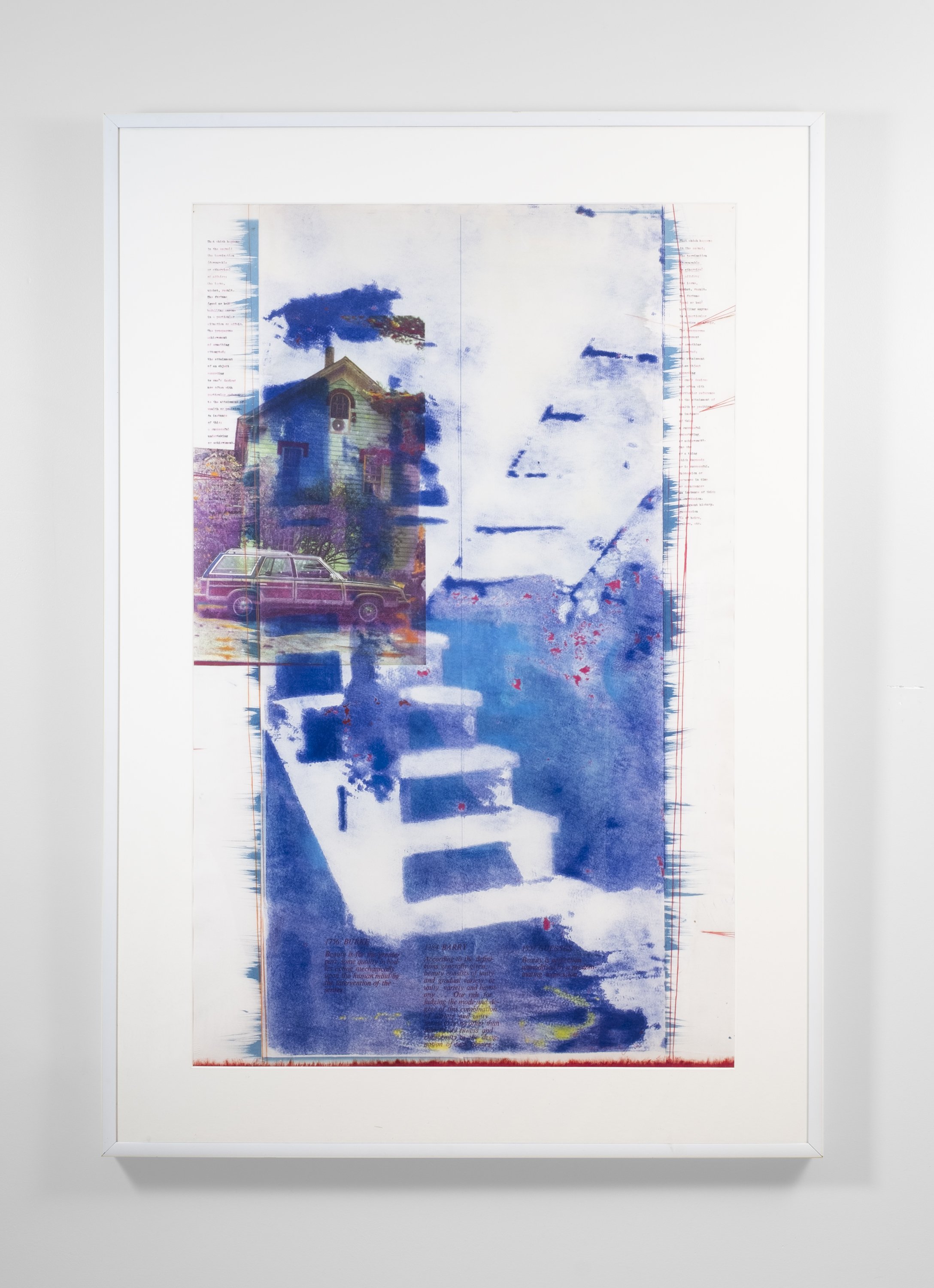
"The work is mixed media on paper. In the artist's mind, they are drawings. They are drawings because there is ultimately an application of pigment by friction. They are mixed media because there is no limit to what can be done prior to the use of friction. Media includes cyanotype, collotype, intaglio, photocopy, solvent transfer, litho inks, spray paint, coffee, gold leaf, letterpress, typewriter, daisy wheel printer, folds, graphite, colored pencil, pastel, dry pigment, collage, cast paper, rag paper and fixative.
I manipulate symbols (stairs, chairs, house, car, interiors, plants, words). Familiar objects have a resonance as distinctive as the viewer. This resonance is a response to objects or images or language. When working on a piece, I try to sustain an idea, often reflected in the title, while applying it to an image which is also an object. With luck, the idea becomes embedded in the piece. It is challenging to both manipulate resonance and allow resonance, because feelings are best felt when discovered."
— Greg Shattenberg
“Greg Shattenberg is an accomplished draftsman and thinker who just happens to use photography as one of the many tools in his box. He nods to Romanticism, employing literary references and dozens of printmaking and hand drawn layers. His lush and beautiful images comment on the personal and the political.”
— Denise Froehlich
Larry Clark
Larry Clark, Billy Mann, From Tulsa, 1968/2005, Edition of 1000, Screen printed skate deck; Acrylic, transfer printed plywood, 31 x 7.5 x 2 inches, Gift from the William Rand collection
Tulsa is a portfolio of photographs by Larry Clark about the life of young people living in Tulsa, Oklahoma. Produced in 1971 and scandalous at the time because of the images of drug taking, casual sex and gunplay.
I was born in tulsa oklahoma in 1943. when i was sixteen i started shooting amphetamine. i shot with my friends everyday for three years and then left town but i've gone back through the years. once the needle goes in it never comes out. — Larry Clark
Mary Ann Krahmer
Mary Ann Krahmer, Kennedy Assassination, 1963/cir. 1980, Open edition/public domain, Inkjet print, 20.27 x 28.5 inches, Gift from the William Rand collection
The original image was a polaroid capturing the assassination of President John F. Kennedy.
"As I snapped the picture of President Kennedy, I heard a shot ring out. President Kennedy kind of slumped over. Then I heard another shot ring out and Mrs. Kennedy jumped up in the car and said ‘My God he has been shot.’ When I heard these shots ring out, I fell to the ground to keep from being hit myself. I heard three or four shots in all. After the pictures were developed, the picture of President Kennedy showed him slumped over. When the pictures were developed, they came out real light. These pictures have been turned over to Officers investigating this incident."
— Mary Ann Krahmer
William Rand, Rene Richard, 2022, Skate deck, 32 x 8 x 2 inches, Gift from the artist
The photo taken with a 35mm Nikon of the art critic-poet at Rand’s New York Studio in 1989. Ricard had been part of 1960’s Guerilla Street Theater, The Warhol Factory and was writing for Art Forum in the 1980s, promoting Julian Schnabel and Jean Michel Basquiat. A friend of Rand’s, and the subject of Rand’s 2022 Rene book. Ricard wrote about Rand’s paintings for an exhibition in NY in 1989.
William Rand is of a generation of American artists reared on images – on consuming them, on producing them, but not on controlling them. This so-called “Pictures” generation, sandwiched between the last world war and the emergence of digital technology, has never felt the agency that those who came before and after them have felt with regard to images. Previous generations gathered in movie theaters, took photographs, and bought picture magazines by choice, with only the occasional billboard or newspaper ad intruding into their visual space. Subsequent generations, by contrast, communicate with and absorb images as part of their sentience, choosing or rejecting pictures and their countless sources as readily, even willfully, as they order from restaurant menus or try on clothes. It is the Pictures generation that, even as it slouches towards superannuation, still struggles with the passive reception of images and what the most effective way might be of managing that reception and, indeed, those images – accepting them, denying them, altering them, mocking them, worshiping them. Pop art gave Pictures artists their cue, providing them a context for critique (albeit one whose nostalgic resonance the younger artists would have to divest). Taking further cue from the Situationists, Marshall McLuhan, and other information-as-spectacle theorists, Rand’s generation embraces and wrestles with images as elements of delirium.
“We are from the first television generation,” Rand observes of Pictures artists. “It was in black and white, like the illustrations of art in our books.” As a figurative artist – best known as a painter, but not limited to painting – Rand practically enslaves himself to images and to the notion of imagery as the basic substance of artmaking. But such enslavement, as Rand knows cunningly, is the most effective way of exercising control. If he is drunk on images, he is all the more in control of what images become in his mind and hands – the Bacchic power of the delirious over the delirium itself. For Rand, the typical artist’s scrapbook, of sketches, collages, and material gleaned from life and civilization, is more than a seedbed; it is a cultivated forest – and its growths and fruits, manifold and diverse, stand as well on their own as they do painted onto a canvas.
Rand’s image bank comprises a never-ending cascade of apparitions from myriad sources – high, low, fine-art, commercial, technical, romantic, graphic, obscure, universal, repellant, seductive, drawn, photographic, journalistic, domestic, exotic, and so forth. Rand deposits constantly into his image bank, but that process of selection – collection, really – is the minor part of his aesthetic and contextual authority. Rand exercises such authority principally by choosing from his bank, arranging and rearranging image-grids for his own painterly purposes and equally for the purpose of direct presentation as wall- and even room-sized installations, grids of square printouts herding so many cheek-by-jowl associations into the semblance of a narrative flow – a flow in many directions at once. Still calling them “studio notes” – “a personal journal of stray pages” -- Rand describes their assembly as “art channel surfing… The variety of imagery from different centuries combin[ing] into narratives,” noting their “emotional content” as well as their formal qualities.
While the sources of his imagery may be so diverse, Rand traces his method – his format and his style – to the starkness of black and white photography and, conversely, to the fixity of the 12-inch square associated with the packaging of LP record albums. Album cover art, certainly in Rand’s youth, was hardly confined to black and white, but it locked some of the most elaborate and inspired pictorial design of modern times inside a structure as neutral as it was immutable. For their part, photographs appearing in publications were similarly confined if presented in pictorial and fashion magazines, but enjoyed a relatively slippery existence on the less rigidly designed pages of art magazines and, more importantly, newspapers, mainstream and alternate alike. The black-and-white pictorial documents whose ink rubbed off on your hands retained a simple graphic punch, popping up anywhere in The New York Times or your local rag, while gloriously colored art reproductions danced similarly across the pages of Art News and Artforum. All these publications were designed on the same planar grid of square units into which album covers fit so neatly; but while the album art crackled inside their rigid coops, the color-less pix illustrating news stories or quarter-page ad spreads played hopscotch, landing in very different places on page 4 than they did on page 2. In and among the myriad tiles of his appropriated-picture installations, Rand mediates between the instant, unpredictable imagery of periodicals and the sober squares of album-cover fantasy.
But he never breaks from what seems to be a vow of visual silence, or at least quietude. That is, for all the influence of album cover art on his work, Rand has restrained his palette (or at least that of his copiers and printers) to the gray scale. Color has been drained, or prohibited, from his image bank, and the one factor unifying pretty much every image-wall or image-room and all they contain is the black and white palette. In fact, this is close to true of anything Rand has produced as a mature artist. He made his mark in New York as a painter of black-and-white forms and figures – painterly, to be sure, but shadowy and elusive, sepulchral and crepuscular, no matter how glorious or grim the subject. As the late René Ricard wrote of Rand’s work, “… this oeuvre is a meditation on darkness, a painting in the shade.”
Such unstinting allegiance to the tonality of soot stems from a meeting late in the 1970s, while still an art student at the Portland (ME) School of Art, with Fluxus artist Albert M. Fine. Fine took one look at Rand’s painting and advised he stanch his palette and work only in black and white. This was the first of many “covert Fluxus lessons,” as Rand brands them, from the eccentric intermedialist who became mentor to the young artist as he entered the New York art world. In fact, Fluxus, originally coincident with Pop, provided many in Rand’s generation with alternate ways of responding to the image-glut around them. The preoccupation of Fluxus with mediated images, both as signs and as objects, permitted Rand and his contemporaries to grasp images as, potentially, agents in and of themselves – that the meaning of pictures is the responsibility not only of the artists who make (or, more to the point, find) them but the audiences that see them. Artistic authority is a matter of presentation at least as much as it is invention; how (two- and three-dimensional) images appropriated from vastly diverse sources are understood depends on a range of factors operating between artist and viewer. The artwork takes place in that range, making the viewer complicit in the work of art, according to Fluxus forerunner Marcel Duchamp.
It is a challenge to paint in the space between artist and viewer, and artists have long relied on their image banks to navigate that gulf. For the past century and a half, certainly going back to that moment in the 1880s when the camera was made technically and commercially available to non-professionals, artists have compiled image banks – as much with scissors as with lenses, but always with the sense that they were “taking notation” from the image-world around them. Fluxus practice, reductive and meditative even while antic and contrary, concentrates on that notation, encouraging artists to forge their own pictorial languages and allow multiple translations to occur in the space between them and their audience. Albert M. Fine pointed William Rand toward this kind of thinking, this reliance on the vagaries and broken strands of communication, a reliance that yields a continual, ever-changing stream of self-sustaining interpretation. It is a Babel-like condition, but one whose art is found in its very incoherence – and whose incoherence is mitigated and at the same time amplified by the artist’s sensibility. It is an embrace of pictures, true to Rand’s generation. In the expansive assemblies of image-tiles that comprise his installational work the elements of surprise, contradiction, academic and personal obscurity, and even satire collapse upon one another to yield a whole new structure, a structure where images mean neither what you, or Rand, want them to mean – nor do they mean anything else.
— Peter Frank, Writer, Curator, Critic
We are now far enough from these events that this diary has the effect of a time capsule. I’m struck by how very different the art world was back then. It is amazing how conservative things have gotten. I think people would be completely shunned today if they exhibited this type of behavior. Which, during those days, was practically considered normal. Rene Ricard was one of those outrageous bohemian figures who had lived live on the edge every single day — like Gregory Corso or Bob Kaufman or Harry Smith. Nobody can tell the future, but I don’t think figures like that are going to come our way again, I’m not sure why, and I hope I am wrong, but it’s just a feeling I have. People were different back then, I think it had to do with the way they were brought up and the things they saw happening in the world, whether it was the atomic bomb, the beat era of the 1950s or the counter culture revolution of the 1960s. These were one time events never to be repeated. Even at the time I was aware how unique so many of these characters were, like Rene Ricard, William Burroughs, Allen Ginsberg. For me they were truly gods who walked the earth.
I think the method that William Rand used to document these events was brilliant: just write a few lines down on a sheet of paper and throw it into a shoe box. I think something people don’t always realize is, if you do a little every day, years later it adds up to a lot. The poet James Schuyler once said to me:” The important thing about keeping a diary is not to get upset if you miss a day or a week or even a month. It’s only when you start missing entire years that you should begin to be concerned.”What I love about this diary is while it focuses on Rene, it gives the reader all sorts of details about the New York downtown scene: The restaurants and bars, the transvestite clubs, gallery openings, passersby and random street crime, etc. There’s also a marvelous cast of supporting characters: Taylor Mead, Dame Margo Howard-Howard, Andy Warhol and the now legendary episode of Ed Brezinski being rushed to the emergency room after eating a Robert Gober artwork.
Rand’s powers of observation and his literary skills are keen and subtle. Numerous times now I have read the book through in a single sitting. Having lived through this era, having known nearly all of those characters and even appearing in the dairy once or twice, I can attest to the accuracy of these events and descriptions, both in letter and in spirit. The combination of the minute and the momentous make for a riveting reading experience. It’s hard to believe people lived this way and survived. (Well, some of them at least). I think one thing that readers should know is that Rene himself actually managed to get out of this vicious circle of addiction and trauma and homelessness, and went on to live another twenty years of a productive life as a painter and a poet. Which just goes to show, where there is life, there is hope. And despite his (at times) rather extreme personal transgressions, if Rene stood for anything, it was LIFE.
Let’s not forget that a large number of people valued Rene’s talent and responded to his intelligence and personal honesty, to the extent of taking him in for the night, paying for his meals, publishing his poems, giving him gallery shows, coming up with the excessive fees for poetry readings that he demanded (and deserved) etc. This book is testament to that sense of community. This was a family—a highly dysfunctional one, but then again, what family isn’t? Stan Brakhage once said about the Harry Smith oral biography American Magus, it…was almost like being with Harry, and certainly a whole lot safer.” I feel that way about William Rand’s dairy.
— Raymond Foye Writer, Editor, Curator, Publisher
Timothy Greenfield-sanders
Timothy Greenfield, Rene Ricard, 1981, Inkjet print, 14 x 11 inches, From the William Rand Collection
Timothy Greenfield-Sanders is a film maker and photographer and one informs the other. A list of his portrait work reads like this: Art, Black list, Celebrity fashion, Boomer list, Politics, Out list, Trans list, Women’s list, Injured Soldiers and Marines. His prolific career is the most active from the 1980’s until today.
Timothy Greenfield, William Rand, 1982, Inkjet print, 14 x 11 inches, From the William Rand Collection
Mathew Rolston
Matthew Rolston, Don Johnson, Polo Clothes, Miami, 1986, medium, 14.75 x 14.75 inches, From the William Rand collection
Matthew Russell Rolston might be best known for his celebrity focused work in Interview magazine. The photograph you see here is part of his editorial portraits from 1977 to 1993. He photographed Hollywood celebrities for a Ralph Lauren campaign featuring polo images and the likes of Don Johnson and Sylvester Stallone to name a few.
“My very first client was Andy Warhol for Interview magazine,” he recalls. “My second client was Harper’s Bazaar. My third client was Michael Jackson.” He then rethinks this. “Actually, my third client was Jann Wenner, for Rolling Stone,”
— Matthew Rolston
Rolston's photographs recall the glamour of Old Hollywood with postmodern irony, helping to point the way towards the cult of fame we live with today.
— Jennifer Algoo


